Wednesday, October 10, 2012

Introducing...Carla Moss Interiors


“Carla....Carla...Are you there, Carla..?”  I know what you’re thinking.  That I fell knee deep in mauve paint for a demanding client and I’m not able to slosh my way out of the law suit.  Maybe poor sweet Carla just couldn’t deal with all the hub-bub of managing: school, hubbie, kids, clients, church, family and volunteering and just quit life. (ok, that last one might be true on any given day) but the reality is that I have been uber busy starting my own business and it’s exciting!

After months of re-evaluating my goals and dreams, I came to the conclusion that interior design is what gets my engine revving.  The furniture, the colors, the fabrics and the clients all keep me coming back for more.  So, the time has come...introducing...Carla Moss Interiors...


Carla Moss Interiors is the culmination of months spent planning the design firm of our dreams.  Together,  we are dedicated to provide good design options to our clientele in any stage of life through varying rates and services - on other words, we can customize our jobs for you without sacrificing style.

We would be thrilled to have you as part of our Carla Moss Interiors family!


Just visit our website and simply type in your email address below the icon above and hit subscribe. And if you would be so kind, recommendations are always welcome.  Nothing says thank you more than a referral to friends and family.  After all, we have the coolest clientele ever.... Thank you for your encouragement.  Without our peeps, this would all still be a dream floatin’ around a bar somewhere. 

To the dream - 

C

Tuesday, July 19, 2011

DIY: IKEA nightstand transformations

Nothin beats a trip to IKEA.  Could be the deals, could be the $1 kiddie cones, the inspiring vignettes or the smell of delectable cinnamon rolls wafting through the air.  Whatever the draw of IKEA, one thing is certain - it's a designing wonderland of possibilities certain to please even the most particular designer palette.  In this kingdom of creativity, one is able to take a seemingly uninspired block of blah furniture and turn it into a spectacular showcase piece with a wee bit of ingenuity.


Would you guess this piece came from IKEA?  Details on Design Manifest

So...how does one go about creating these pieces of furniture pageantry?  Take for instance the nightstand below.  Humdrum, lifeless and basically blah (unless you are in a woodsy cabin in the mountains).  For most of us, we might just pass on by this little jewel but that would be ashame....Sharpen your pencil and smooth your paper.   Start brainstorming how to change this into something that fits your home and style.  Or if you are still leery about where to begin, check out the pages below with attached links to gain some more iillumination. 
IKEA Rast Nightstand for $29.99

Transformed into this beauty by Marcus Design

Check out this revamped nightstand by Aubrey + Lindsay on the exact piece.

Another take on the nightstand by Design Sponge


Brass Hardware by Lee Valley makes this one sing by Design Manifest


Classic Simplicity by Samantha Muse


A burst of sunshine from Smitten Studio

Colorful change by Get It Girl Style


Gold rings and paint bring a modern look from Armell Jewelry


A splash of Chevron makes this version pop from What The Vita

If the pics above don't bring some much needed creativity, I don't know what will!  Let me know which one is your favorite --- and as always, I would love to hear from you with the results of your own project.  Stay tuned for more DIY projects from our blog and be sure to visit Dwell With Dignity blog.  Every Monday features a DIY proven to arouse your inner design diva. 

Until next week,

C

Tuesday, July 12, 2011

Client Install: The Master Bathroom

Many of my faithful readers will recall the master bathroom I referenced in a previous blog that I was working on with my fantastic client.  Here's a peek at the results of months of meticulous, yet very exciting, planning and execution. (Drum roll, please......)  "I feel like I'm in a 5-star hotel," she says.  Music to my designer ears.  Enjoy browsing as you take some time to contemplate your design desires.

Natural elements create a relaxing botanical spa atmosphere

You'll recall that the adjectives : cave-like, spa, modern, not too trendy all needed to be part of the final product.  Having to work around existing windows and walls were a tiny hinderance but the results are beautiful!  (after all, a few boundaries never hurt anyone, right?)  Since there were other tubs in the house, we removed the master tub and dropped in a luxurious shower.

Polished nickel for the finish throughout the bath provide that much needed sparkle in the room.  Faucets from KIVA in Dallas.  Countertop from Ann Sacks called Idyllwild.  All of this declared "Victory!" in our quest for a master bath worthy of spa jealousy.

Careful not to overlook knobs, these choices are substantial and truly hum with design potential.  Towel bars complete the duo.  Both sets from Restoration Hardware.

I think my absolute favorite part is the plank flooring from Ann Sacks.  Each piece is so unique.  Another fave is the "Suede" tile glistening in the light.  Combined with the ovesized flooring planks, the bath seems to be so much more spacious.  We combined both existing taupe towels with some crisp new white ones to add that punch of pizazz.


Although we did covet a mirror from Ann Sacks,  it was a bit outside our budget and we much preferred the gorgeous tile so Restoration Hardware provided a gorgeous substitute.  Matching the stain on the mirror to the cabinetry in the bath was just what we needed to put this project into overdrive.

Although original artwork was out of the question this time around, we discovered just the perfect compliments to our project at ZGallerie and Crate & Barrel.


Dual shower heads and xl- cubbies were carefully thought out in the awesome shower!

While my clients were enjoying a night game with the Rangers, I snuck in a few finishing touches from Pottery Barn and Crate & Barrel. You can imagine how fun it was to receive texts with their excitement later that night....

My top three lessons learned on the job:

* Contractor Communication - I was under the impression the contractor was doing all the CAD drawings and measurements.  He wasn't and it caused a few issues.  I would have probably gotten a different contractor or did some more detailed drawings myself. Never assume anything.

* Limits - I had to increase my credit limit on my company credit card from all the purchases I did on one day. Little did I know how quickly things add up when you are ordering as fast a possible.  :)
* Final Touches - The rooms looked great when the cabinets, flooring and hardware was complete.  But the real dazzling part is always the night the final touches are added.  The touches, the accessories and the pops of color that really make all the difference in the room.

Many, many thanks to my wonderful clients!  It was a spectacular experience and one that I look forward to repeating many times over with other individuals.  Remember, bathrooms are more complicated than we give them credit for being -- plumbing, lights, water and cabinetry all factor into this circus.  BUT... the payoff on the other side is great!  And so worth it all.

With gratitude-
C

Tuesday, July 5, 2011

Room of the Month - The Guest Bedroom

Summer brings travel.  Travel brings guests.  And guests can bring all sorts of stress.  Why not take your summer guest stress down a notch with a little bit of guest bedroom know-how?  With my summer jaunts to Watercolor, Florida and Wisconsin, where I stay hugely influences my vacay attitude.  There's nothin' like a comfy getaway to issue in a perfect night's sleep -- all without stress.

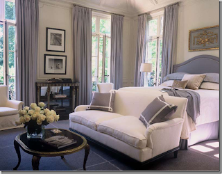
Suzanne Kasler hits this guest room right on the head.  Don't you want to just curl up in the bed?

Before we point the finger at anyone else, the better method would be to examine our own guest quarters. What does your guest bedroom look like?  Does is exude tranquility?  Is it a site for guests to dream about long after the visit?  Has it become your laundry storage? Or maybe the dog's playroom?  Extra office/clutter room?  I think you get my point.  There are some important things to consider when creating your own guest oasis.  Take a look below:


Bedroom design by Scott Laslie

1) A real bed - By real bed, I mean a good mattress.  There is nothing worse than sleeping on a pencil thin fold out mattress with a rod running through the middle.  Reminiscent of cheap hotels.  Consider getting a solid mattress along with frame and your guests will thank you.  If a pull out couch is all your casa has to offer, then double check the mattress - would you sleep on it?


2) Reading lamp - Having a reading lamp near the bed is essential in guest room etiquette.  They might stay up late reading to get drowsy or they might be early birds who like to read until breakfast.  Whatever their style, make sure that the lamp is within easy reach and won't require someone to pop out of bed to operate it.

I love this lamp by Jan Showers. Venetia Series #3.


3) Nightstand - Standard, yes.  Necessity, obviously.  The nightstand is mulit-purpose.  It may serve as a place to put your evening water glass, to store clothes and books or to set the alarm clock.

This nightstand was featured in the San Francisco Decorator Showcase 

4) Flowers - Fresh flowers say "I'm thinking of you and I'm glad you're here."  A small vase topped with a few blooms is just sparkling. Grab them from the grocery store when you are stocking the frig.
These simple roses are a great touch.

5) Water - We've all woken up in the middle of the night with dry throats from traveling. Placing a bottled water or even a carafe of water nearby your guests will ensure comfort.  It also keeps them from having to move through an unfamilar dark house in search of agua.
 I love this bedside carafe from Crate & Barrel.  The 6 ounce glass fits right on top of the pitcher.

6) Extra Blanket or Throw - I find that there can be quite a varied temperature range in homes.  Although we could discuss the finer points of home temperature decorum, suffice it to say that an extra blanket is always appreciated.  Nothing too intense -- a light throw or and extra mid weight blanket is appropriate.  The point is to give your guest an option. 

An extra blanket or throw at the end of the bed will work great!

So...as your calendar fills up with summer plans be sure to make time to adequately address your guest bedroom.  Even if you don't end up utilizing it this summer, there's always Christmas and Thanksgiving that might bring some extra faces to your home.  Remember - enjoy your summer and your guests!  Stress free.

Expectantly-
C

Tuesday, June 28, 2011

Interest in Pinterest

Every now and then there is something I get really attached to.  First, it was an addiction to magazines and shelter magazines like High Gloss.  Later it became my ipod...followed by my iphone...and the migration to my husband ipad.  Lately I found another thing that's quite addicting.  Pinterest!

Image from pinterest

The pinterest website

Pinterest is a website featuring an online catalog of awesome images.  It allows you catalog the things you love. People use it to plan their weddings, store potential additions their wardrobe, organize recipes...and for people like me -  inspiration for interior design!
Check out this room design pinned by a pinterest fan.

Before I met shelter mags and Pinterest, I had (and still do) hanging files by room with inspiring images and tear sheets I've collected.  Over time, I developed online files by room that I save pics into from favorite shelter mags and blogs.  And now with Pinterest, I now have an online site to save them off too!

A room by Mary McDonald, one of my fav designers that I can search on, pined by a pinterest friend.

Another room I will "pin" in my file.  Love the contrasting paper in the shelving.

With Pinterest I can store not only images of rooms I love, but can also pin architectural drawings, fabric samples, paint, floorplans, furniture and even design books people have recommended.

 A design book I can pin to my board and remind me to purchase it down the road...


an interesting floorplan from another pinterest fan..

artwork that has tons of potential in the right room...

or fabric for pillows that would make the room pop...

or paint samples of the perfect color...

and piece of furniture I could potentially use for a client.

Best put by this pin, pinterest has ton of potential!

The options are endless.  So take a peek for yourself and setup your pinterest account.  And don't respond to this blog and tell me you are addicted...I warned you!

Tuesday, June 21, 2011

Class Update: AutoCAD

"As far as I'm concerned, progress peaked with frozen pizza."  Although this quip is aptly spoken by Die Hard 2 main character John McClure of movie fame, it's quite obvious to me that this dude had never taken an AUTOCAD class.  This class was worth the long wait.  Finally a skill that make me much more marketable - time to update my resume!


Why all the fuss about AUTOCAD?  Simply put, AutoCAD is a software tool that allows a designer to create: floor plans, elevations and furniture plans.  Designers, builders and contractors use this ingenious tool to communicate building and design plans. 


Model space is where it all began for us.  It's like having a white (or black in this case) board with all your plans in it. From that board, we created multi level house complete with stairs and wall elevations.  This was just the tip of the AUTOCAD iceberg.


While I was learning commands (like FILLET, MIRROR, VIEWPORTS) we also learned to work in paperspace.  By putting our designs on humongo paper, we were able to view and discuss them during the class.  Alot like manual drafting but quicker and much more attractive thanks to the computer.  I guess you might call it a mix of old school and new school techniques. The outcome is spectacular!


Here are my kitchen and bath elevations, complete with dimensions and notes. And let's not forget the title bar.


Then there is the Furniture Plans (which all designers complete).  With layering in AUTOCAD, we were able to turn off certain elements of our design so that we could evaluate just one certain item.  In this case, it is furniture.  By turning off the dimension on the drawing, you are able to examine exclusively the furniture arrangement.  


Although I learned mainly with a recorded tutorial, I was required to interview a current AUTOCAD user.  So I picked Celine - my friend and co worker at Marco French Studio.  Below is an excerpt of my Q&A with Miss Celine:


Q1: When do you use CAD in the production process (e.g. preliminary design, design development, etc.)?
We use CAD during design development and to finalize a design.  The precision of CAD helps ensure that there will be no mistakes in size or scale.  We use it for furniture layouts as well as window elevations that show the various treatment options, etc.  It also helps once selections have been made - CAD is also essential to designing custom items such as: cabinets, chests, chairs, tables, etc.

Q3: What are the advantages or disadvantages that CAD brings to your practice?
Advantages:  CAD is accurate and you are able to make quick changes to drawings all the while looking professional.
Disadvantages:  You get out of practice with hand-sketching.  But most importantly, everyone has different drawing style, even in CAD,  making it difficult to pick up where someone left off.

Q8:  What advice would you give a students, people in my online class,  who are learning AutoCAD and hope to utilize it in the future?
Find an internship where you can use it or just be sure to keep using it as much as possible.  It all comes with practice and unlike some of the things you learn in school, this will be one of the important skills you are expected to have.  In fact, in one of my interviews, I was asked to create a floor plan in AutoCAD and it was timed.  I did very well and someone else got the job, but it just goes to show you that it’s an important skill to have and your employer will expect you to use it.

Thank you, Celine, for your insights into the real workings of CAD!


Overall, I got a real kick out of this class.  The software is fairly intuitive and so it flowed somewhat easily.  (maybe it was all those long hours spent slaving away in my former life as a business consultant at Accenture). Whatever the reason, I knew from the beginning that CAD would be the most valuable class to complete early on in my course work.  So, I finagled schedules so that I could get to it fast.  My advice is that you do the same.  


Despite what Hollywood may tell you in their flicks, technology is the bomb!  Specifically, CAD.  Remember...pizza is good but CAD is better.  Maybe not as good for your tummy but definitely better for your waistline plus CAD keeps you current in the job market.  Stay tuned for Modern Art to follow after a 3 week hiatus from school...


Off to the beach -


C