Tuesday, January 25, 2011

Good-bye Williams Sonoma Home


An open letter to Williams Sonoma Home:

“Farewell Williams Sonoma Home! 

I shall miss you.  Your arrival at the Shops of Legacy caused my pulse to quicken quite a bit and my palms start to sweat with exhiliration.  Your departure from our area doesn’t mark the end of a decorating boom in the burbs but rather leaves us with a void hard to fill.  Sure. I know your goodies are available online, but what good does that do for my retail therapy?  You are the reason that Benjamin Moore Shaker Beige #HC-45 graces the walls of my dining room.  Your example of this beautiful color brought joy to your shoppers and even more joy to my family. So, from the bottom of my heart - thank you.  When you decide that the outer midst is for you again, please think of me and smile.

Warm Regards-
Me”

The stylish Plano location is no longer.

Yes, that’s right....Our one unique cool icon in the suburbs has fled for more profitable ground, if not for good.  Williams Sonoma Home is ceasing to exist in our neck of the woods and I am bummed!  The only thing that literally kept me from throwing myself across the 24 foot by 24 foot sisal rug (you heard me right friends..) is the fact that everything in the store was rock bottom pricing and that’s makes me SO happy.

By the time I got there last week, things were picked over to say the least.  (Or as Dr. Phil might put it “Looked like they were rode hard and put away wet.)  The store was a shell.  Nonetheless, I managed to discover a few goodies that I just couldn’t pass up.
The Keith desk...big time on sale.

First up on my must buys was a new office desk.  High quality manufacturer Hickory Chair produces this stately piece aptly named the Keith Desk.  Being that it was the floor model and being that the doors of the store were shutting in a matter of days forever, I got the desk at 60% off retail.  Kill me with a feather!  I was shocked.  Despite the few scratches on the top of the piece, I knew that this was the one for me.  Keep in mind that I have been using hubbie’s desk from college days. (no offense, sweetie...)  Hubbie bought the desk when he got his MBA too many years ago to speak so it had done it’s duty.  I bet Walmart never counted on that desk being around that long.... Sure, I had done the whole re-purpose thing and slathered on a coat of white paint but it was micro.  I mean small - very small for my growing needs. Now that I am official switching to the Art Institute Online school, I am spending more time in my office so desk space is vital.  (Quick shout out to my buddy Jen...Thanks for helping me load the beast into the Pilot at a moment’s notice.  Those salespeople...that’s another story altogether).

To add a little spunk to my office, I am considering a cowhide rug to anchor the room underneath the desk.  Last semester, I encouraged one of my friends (Chris) to draw a cowhide rug in his 2 point perspective class only to realize that they actually sell them at IKEA.  Seriously? IKEA?  Sure enough, there they were on the website.  Check it out...
$199 at IKEA for a cowhide in brown or black.

On addition to bovine decorations, I would also like to add a big table lamp for one corner of my desk.  Similar to the one in this photo to be precise.  This past weekend, I spent some time shopping on the square in McKinney - hoping to find the lamp with the perfect shape for a great discount that I could re-fashion with some yummy paint and a new drum shade.  Unfortunately, I came up empty handed but am not deterred!  I will stay the course and find my lamp.  McKinney or not.

To round out the desk area, it’s goodbye to swivel and hello to bamboo. Carved bamboo to be specific.  My chair is similar to the red one in the picture except mine is white.  This, too, is another score from an end of the season at Williams Sonoma Home a few years back.  It’s likely that I will change out the seat cushion for one with more umph as too much white can start to wear on me after a while.
My desk chair...except mine is in white.

And finally, my awesome purchase of some sea fans.  On sale at WSH also and such a steal at $12.  They will look spectacular in some gold frames that I have hanging in the hallway looking really lonely and sparse.  I am hoping to get them framed tomorrow and on the wall pronto.
To be framed sea fans... 

So, it’s time to bid adieu to one of my favs and make room for something even more wonderful.  It’s sad really.  Seems like all my choice design shops drift away out here in the outskirts.  But with that vacuum will come some good healthy competition.  Horchow Finale and Inessa Stewart Antiques -- please don’t get any ideas about moving.  A designer like me is not strong enough to take that type of torture. 

Bon voyage-
C


Tuesday, January 18, 2011

Room of the Month - The Nursery


Each year Presbyterian Hospital of Plano bestows upon one lucky child the honor of being the first child born in the new year.  I have to admit that it is a secret indulgence of mine to follow those babies.  Admit it.  You like to see them too!  Those cute little red faces with slits of eyes and a worn out momma smiling from ear to ear.  It’s really quite sweet.  With all this hoopla, it just makes sense to follow suit and have our first 2011 Room of the Month to be the Nursery.

Some of you may recall that earlier this year (or should I say in 2010), I had the distinct honor of decorating a room for my spectacular niece on the birth of their first child.  I was in heaven -- with ducks and green and baby stuff. Although that was several months ago, there are some things that I have learned about decorating a nursery along the way.
1) ASK FOR HELP – A nursery can be overwhelming for many reasons-- namely that this is the first official room that most young parents will are actually going to buy furniture for in their home.  The options are endless and quite frankly too many.  I have seen some over- the-top themed rooms and ugly nurseries in my time and it’s quite uncomfortable from a design standpoint.  Excitement for the baby does not equal good taste.  Ask for help.  Save pictures from magazines.  Enlist family and friends and ask them for their unbiased opinions.  Ask, ask. ask! 

Check out one this book on children’s room by my favorite designer, Kelly Wearstler and her friend Susanna Salk.


2) AVOID YELLOW – Although very sunny and extremely happy to us adults, it has been proven that babies tend to cry more when they are in yellow rooms. (I learned this in my color class last quarter).  Given that yellow is the first color that we see and it’s the same color that all colors lean toward when one’s sight starts to fade, yellow is nothin’ but trouble at the beginning of life.  (Yellow should also be avoided in nursing homes as well.)  Let me tell you a tale from my own life to expound more on this yellow phenomenon.  We painted our first son’s room yellow and then he had colic.  Why didn’t someone tell me?  It was brutal.  If passing on yellow is not an option, then use in small doses like in the picture below to avoid an all out cryfest on your hands. 


3) PICK A DIFFERENT COLOR.  Decide on a main color -- preferably something soothing and then dig for an accent color to coordinate.  If you are not having an kind of luck finding the color of your choice, choose an oversized print for the wall and then pull from that.  Take the following example from Domino magazine.  Notice how the map is the focal point of this wall and that the orange accent is brought in with the storage.  Tidy, smart and whimsical.  
4) PAINT IS YOUR FRIEND.   Budgets are tight with a new one but not creativity.  Hand me down furniture is the best along with a good coat of paint.  That old dresser covered with a fresh coat of jazzy color with new knobs thrown in for good measure is just what your baby ordered.   Old frames also receive new life with a fresh coat to coordinate with the accent color.  Chandeliers, headboards and old desks all fit the bill for reusing older pieces in a fresh way.
I suggested a similar color of orange to my niece Leah when she painted her dresser.


5) DON’T FORGET MOMMMY – Since Mom (and on weekends Dad) is going to be spending beaucoup of time in this little person faciltity, it’s very important that Mommy feel comfy in the room as well.  A good rocking chair with ottoman that fits both you and baby comfortably is of utmost importance.  Spend more money there is needed.  You are going to be there alot.  Make certain to add a bit of glam with a glitzy chandelier and some sort of mirror.  (Babies love to star at themselves and it brightens up the place.)  All this adds up to a room that is both parent and child friendly.
The sophistication of this baby room is balanced with the light hearted stuffies of bears and more bears throughout the room.


6) AVOID THE THEME  - Do not count on your son being in the NFL when you go to buy your furnishings.  The chances are slim unless of course your husband is in the NFL in which case, deck it out!  Avoid the themes.  Purchase a few special items to place in the room that you would like to see your child love eventually but keep it to a minimum. (despite what all the stores would have you buy...)  Your child will become their own person soon enough complete with an opinion.  Let the room take on the personality of the child as that child grows into their special person.  Then you won’t have a choice!
No theme here...but so fun! 
Tommy Hilfiger pulls it off here, but remember the majority of us can’t get to a theme like this without being cheesy.  Also, we don’t have Tommy’s checkbook either.


7) GO WITH INEXPENSIVE CARPET OR RUGS– Your new baby deserves a great nursery, but remember your baby is still just that - a baby.  They are going to spit up, throw up and pee on the carpet.  This could go on for a few years….so keep that in mind when shelling out money for a new rug or carpet.  Love the simple one in this photo and how red is used as a great accent.
 8)  BOOKS!  - Every parent commits to reading to their child.  Be sure to have a place for books, whether it be a bookshelf or baskets.  Also remember that books make great accents.  You can tear out pictures of your favorite childhood books and frame them for your wall (visit your local half price book store for used books and frame them in odd numbers).  They also look great stacked on a bookshelf or dresser, maybe even with a stuffed friend on top. I like how they mixed frames, accessories and animals friends with the books on this shelf.
 9) TOYS – Bring in the toys!  They make great accent pieces and kids loved playing with them.  The oversized stuffed bear and rocking horse will work wonders if you figure out how to best use it in the room.
10 ) THINK AHEAD.  Baby grows up very quickly so consider how the room might morph as your baby turns into a child or even a young adult.  Although this might be several years down the road, plan for the long haul.  If something changes, good for you.  If nothing changes, good for you. Either way, you win.
I love how they used these bookshelves…perfect layout of a twin bed down the road too.


So, for now I will put my nursery urges to the side in favor of a more tranquil night time routine.  Take some advice from one mom to another mom - concentrate on the baby and the room will take care of itself.  You will discover the truly important pieces of the puzzle with time.  Listen to others and ask.  All of us moms are with you!  And remember...no yellow.


Happy baby-


Tuesday, January 11, 2011

A trip to the Wisteria Outlet


I love Wisteria.  Their products are so dreamy and sophisticated.  Several months ago I got a card in the mail stating they were re-locating their outlet.  Across from Love Field at 6500 Cedar Springs Road to be exact.  I was so excited, but my schedule was too full to make the journey.  Weeks later, with a break from school, I was able to venture down there and check it out.  Here is what I discovered...

First of all, the new space is huge!  It's about 20,000 square feet, more than double the size of the longtime Carrollton location on Luna Road.

There are several beautiful vignettes featuring their products.  I like to think of their look as casual French...

...with a rustic, old touch.  But they have pieces from all over the globe.    I love the red coral...and the whimsy red dice on the shelves above.

They have lots of damaged furniture at discounted prices.  Coffee tables, dressers and other great finds were plentiful.

In addition to furniture, they have tons of accessories including many glass containers...

...and some hand blown glass candlesticks at 15-25% off retail.

Mirrors are a big seller at Wisteria too.  I love their sunburst mirrors and have featured them on previous blogs.  Many were on display here and ready for immediate purchase.

And for those of you who know me well, I always love a little sparkle.  How about this mirrored piece for a bedroom side table?  Gorgeous!

There was another area completely packed with lamps.  All very unique...and all marked down.

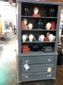
Gray furniture is so on the scene now and this is one beautiful piece.   I like how the small white vases and red antique books really highlight it.  And all of it was on sale too!


Did I buy anything?  Well, I fell in love with this console.  I asked how much it was and no one knew.  As I was waiting, I began to envision it in my living room, right behind my sofa.  And if it were 40% off, like much of the other furniture there, it would be such a steal!  They came back to tell me…it’s brand new, no discount.  I was a bit disappointed, but realized that it just bought me more time.  I will keep it in mind….perhaps down the road I may find a damaged one on sale.

So...if you are thirsty for more, check out their website and request at catalog at www.wisteria.com.  Or simply visit the outlet in Dallas.  You are bound to get at least 10% off...and call me, I may meet you down there.

Love, C

P.S.  I did officially transfer to the online division of the Art Institute.  I am currently taking Space Planning for the next 5 weeks, followed by Perspective.  It's been a great transition.

Tuesday, January 4, 2011

Opportunity: Another Interior Design School?


New Year.  Time for reflection.  Time to take note of what is going on in life and to think about the future – what to change?  what to keep?  how to go about it? For many of us, the New Year breathes a sense of excitement as to what the upcoming year holds. Yet as my year commences, I find myself a bit more pensive than usual about 2011.

I'm always telling myself to be open to new opportunities...
(stylish door of designer Kristen Buckingham's store in LA.)

As my faithful readers may recall, the Moss clan had considered a move to Big D.  The discussion centered around both hubbie and myself being closer to work and/or school (cutting the commute and tolls in half) as well as various other really good reasons.  Also part of the diatribe, is the fact that I am absolutely in love with interior design.  I am living the life that I should have lived the first time around.  My job is wonderful.  I look forward to it every day – drive time or not.  Those two worlds (the time and the dream) often collide.  Despite the occasional, “Wow, you are living the dream”comments, my life is out of whack right now. Something has to give.

Enter the infamous pro/con lists.  With my life tilting towards crazy sidled up next to exhausted, it’s time for a new outlook.  Take the Art Institute of Dallas:  phenomenal professors, awesome classmates, and a perfect 4.0 gpa.  Cons of the Art Institute of Dallas: challenging schedule, limited class time frames and a young family that needs me around.  (A quick shout out to my homies in the hood – thank you for your tireless efforts to shuffle kids in order to make my dream come true and to you, hubbie.  You are more supportive than the typical bear with those two crazies in tow.)  So, what are the possibilities?

Monday 8:00am – 12:00pm  - Kids get on bus without me in conjunction with the aid of my neighbor for 12 straight weeks.  Monday holidays thrown in create much stress.

Tuesday 6:00 pm-10:00 pm – Head out for school at 4:45 to battle rush hour.  Drive downtown with kids so honeybun can meet me to trade boys and head home with them for dinner.  Total kid time in the car …over 2 hours.  Reminiscent of  planes, trains and automobiles.  Hubbie travel schedule picking up so out of luck on travel weeks.

Saturday 1:00pm-4:00pm –Sweet!  Honeybun at home and very little traffic.  Not so sweet.  Number one’s b-ball games at 1:00 so I will miss all of them.  Did I mention 4 hours on Saturday???

Do you see my dilemma?  It’s a never ending cycle – time away from family or time away from my life dream.  Time away from my life dream or time away from my family.

Thus emerges option numero dos -The Art Institute of Pittsburg Online Division.  I initially considered this as an option but at that time the school was not CIDA accredited.  In other words, the program would not have let me sit for the NQIUDA exam at the end of my degree.  That’s a big deal in the design world.  Low and behold, if that silly school did not gain their accreditation within recent months!  Problem solved…almost. I still need to do some more evaluation of the online option but it does offer me some flexibility that was not available to me earlier and for that I am thankful.

More time attending school in my home office?  It might be a better option....

It’s a bit of bummer, since I’m very social and love working with other people.  But the tradeoff for increased family life while still earning my degree is just something that I can’t snub my nose at right now.  Funny thing is that I have already “met” some really cool people from my online class proving that I can release my inner social butterfly just as easily in cyberspace as in real life. 

With the beginning of the year, comes the beginning of a new adventure.  Join me in taking stock of what’s spinning around in your life and press towards those things that give you pleasure – without risking the relationships of your inner circle.  Don’t be afraid to look long and hard at the opportunities available to you.  Live your dreams with confidence. Here’s to 2011!

Stay tuned,
C