Tuesday, July 19, 2011

DIY: IKEA nightstand transformations

Nothin beats a trip to IKEA.  Could be the deals, could be the $1 kiddie cones, the inspiring vignettes or the smell of delectable cinnamon rolls wafting through the air.  Whatever the draw of IKEA, one thing is certain - it's a designing wonderland of possibilities certain to please even the most particular designer palette.  In this kingdom of creativity, one is able to take a seemingly uninspired block of blah furniture and turn it into a spectacular showcase piece with a wee bit of ingenuity.


Would you guess this piece came from IKEA?  Details on Design Manifest

So...how does one go about creating these pieces of furniture pageantry?  Take for instance the nightstand below.  Humdrum, lifeless and basically blah (unless you are in a woodsy cabin in the mountains).  For most of us, we might just pass on by this little jewel but that would be ashame....Sharpen your pencil and smooth your paper.   Start brainstorming how to change this into something that fits your home and style.  Or if you are still leery about where to begin, check out the pages below with attached links to gain some more iillumination. 
IKEA Rast Nightstand for $29.99

Transformed into this beauty by Marcus Design

Check out this revamped nightstand by Aubrey + Lindsay on the exact piece.

Another take on the nightstand by Design Sponge


Brass Hardware by Lee Valley makes this one sing by Design Manifest


Classic Simplicity by Samantha Muse


A burst of sunshine from Smitten Studio

Colorful change by Get It Girl Style


Gold rings and paint bring a modern look from Armell Jewelry


A splash of Chevron makes this version pop from What The Vita

If the pics above don't bring some much needed creativity, I don't know what will!  Let me know which one is your favorite --- and as always, I would love to hear from you with the results of your own project.  Stay tuned for more DIY projects from our blog and be sure to visit Dwell With Dignity blog.  Every Monday features a DIY proven to arouse your inner design diva. 

Until next week,

C

Tuesday, July 12, 2011

Client Install: The Master Bathroom

Many of my faithful readers will recall the master bathroom I referenced in a previous blog that I was working on with my fantastic client.  Here's a peek at the results of months of meticulous, yet very exciting, planning and execution. (Drum roll, please......)  "I feel like I'm in a 5-star hotel," she says.  Music to my designer ears.  Enjoy browsing as you take some time to contemplate your design desires.

Natural elements create a relaxing botanical spa atmosphere

You'll recall that the adjectives : cave-like, spa, modern, not too trendy all needed to be part of the final product.  Having to work around existing windows and walls were a tiny hinderance but the results are beautiful!  (after all, a few boundaries never hurt anyone, right?)  Since there were other tubs in the house, we removed the master tub and dropped in a luxurious shower.

Polished nickel for the finish throughout the bath provide that much needed sparkle in the room.  Faucets from KIVA in Dallas.  Countertop from Ann Sacks called Idyllwild.  All of this declared "Victory!" in our quest for a master bath worthy of spa jealousy.

Careful not to overlook knobs, these choices are substantial and truly hum with design potential.  Towel bars complete the duo.  Both sets from Restoration Hardware.

I think my absolute favorite part is the plank flooring from Ann Sacks.  Each piece is so unique.  Another fave is the "Suede" tile glistening in the light.  Combined with the ovesized flooring planks, the bath seems to be so much more spacious.  We combined both existing taupe towels with some crisp new white ones to add that punch of pizazz.


Although we did covet a mirror from Ann Sacks,  it was a bit outside our budget and we much preferred the gorgeous tile so Restoration Hardware provided a gorgeous substitute.  Matching the stain on the mirror to the cabinetry in the bath was just what we needed to put this project into overdrive.

Although original artwork was out of the question this time around, we discovered just the perfect compliments to our project at ZGallerie and Crate & Barrel.


Dual shower heads and xl- cubbies were carefully thought out in the awesome shower!

While my clients were enjoying a night game with the Rangers, I snuck in a few finishing touches from Pottery Barn and Crate & Barrel. You can imagine how fun it was to receive texts with their excitement later that night....

My top three lessons learned on the job:

* Contractor Communication - I was under the impression the contractor was doing all the CAD drawings and measurements.  He wasn't and it caused a few issues.  I would have probably gotten a different contractor or did some more detailed drawings myself. Never assume anything.

* Limits - I had to increase my credit limit on my company credit card from all the purchases I did on one day. Little did I know how quickly things add up when you are ordering as fast a possible.  :)
* Final Touches - The rooms looked great when the cabinets, flooring and hardware was complete.  But the real dazzling part is always the night the final touches are added.  The touches, the accessories and the pops of color that really make all the difference in the room.

Many, many thanks to my wonderful clients!  It was a spectacular experience and one that I look forward to repeating many times over with other individuals.  Remember, bathrooms are more complicated than we give them credit for being -- plumbing, lights, water and cabinetry all factor into this circus.  BUT... the payoff on the other side is great!  And so worth it all.

With gratitude-
C

Tuesday, July 5, 2011

Room of the Month - The Guest Bedroom

Summer brings travel.  Travel brings guests.  And guests can bring all sorts of stress.  Why not take your summer guest stress down a notch with a little bit of guest bedroom know-how?  With my summer jaunts to Watercolor, Florida and Wisconsin, where I stay hugely influences my vacay attitude.  There's nothin' like a comfy getaway to issue in a perfect night's sleep -- all without stress.

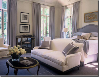
Suzanne Kasler hits this guest room right on the head.  Don't you want to just curl up in the bed?

Before we point the finger at anyone else, the better method would be to examine our own guest quarters. What does your guest bedroom look like?  Does is exude tranquility?  Is it a site for guests to dream about long after the visit?  Has it become your laundry storage? Or maybe the dog's playroom?  Extra office/clutter room?  I think you get my point.  There are some important things to consider when creating your own guest oasis.  Take a look below:


Bedroom design by Scott Laslie

1) A real bed - By real bed, I mean a good mattress.  There is nothing worse than sleeping on a pencil thin fold out mattress with a rod running through the middle.  Reminiscent of cheap hotels.  Consider getting a solid mattress along with frame and your guests will thank you.  If a pull out couch is all your casa has to offer, then double check the mattress - would you sleep on it?


2) Reading lamp - Having a reading lamp near the bed is essential in guest room etiquette.  They might stay up late reading to get drowsy or they might be early birds who like to read until breakfast.  Whatever their style, make sure that the lamp is within easy reach and won't require someone to pop out of bed to operate it.

I love this lamp by Jan Showers. Venetia Series #3.


3) Nightstand - Standard, yes.  Necessity, obviously.  The nightstand is mulit-purpose.  It may serve as a place to put your evening water glass, to store clothes and books or to set the alarm clock.

This nightstand was featured in the San Francisco Decorator Showcase 

4) Flowers - Fresh flowers say "I'm thinking of you and I'm glad you're here."  A small vase topped with a few blooms is just sparkling. Grab them from the grocery store when you are stocking the frig.
These simple roses are a great touch.

5) Water - We've all woken up in the middle of the night with dry throats from traveling. Placing a bottled water or even a carafe of water nearby your guests will ensure comfort.  It also keeps them from having to move through an unfamilar dark house in search of agua.
 I love this bedside carafe from Crate & Barrel.  The 6 ounce glass fits right on top of the pitcher.

6) Extra Blanket or Throw - I find that there can be quite a varied temperature range in homes.  Although we could discuss the finer points of home temperature decorum, suffice it to say that an extra blanket is always appreciated.  Nothing too intense -- a light throw or and extra mid weight blanket is appropriate.  The point is to give your guest an option. 

An extra blanket or throw at the end of the bed will work great!

So...as your calendar fills up with summer plans be sure to make time to adequately address your guest bedroom.  Even if you don't end up utilizing it this summer, there's always Christmas and Thanksgiving that might bring some extra faces to your home.  Remember - enjoy your summer and your guests!  Stress free.

Expectantly-
C