Tuesday, March 29, 2011

Class Update: Perspective

Time is ticking but the clock seems to have come to a long slow halt.  With another class under my belt, 5 weeks have crawled by -- but not for the reasons that you might think.  At this point in the race to become a designer, I feel like I am in the middle of the marathon with no chance of a water break anytime soon.  A graduation date of 2014 looms over my head taunting me.  Ugghh... Sure I could pick up the pace but that would leave the rest of my world in shambles.  Family, clients, job, house hunting and simply breathing takes some priority in my life.  I'm weary but willing!  Enough about me...on to the fun stuff.


So what have I been doing in school for the last 5 weeks?  Drawing, drawing and more drawing.  For those faithful few who have been with me since inception, you will recall that drawing and Carla are not friends.  Despite all of my hang-ups, my professor graciously bestowed on me the gift of an "A" in my Perspective class.  This was not won without much paper ripping and eraser blowing on my part. 
Check out this incredible student sample of an interior.  (Note: This is NOT from me.)  Although I am far from this level of beauty, I sure did learn a lot.  During the class, we learned how to draw one-point, two-point and three-point perspective drawings.  Additionally, we discovered that a composition is never complete until the shading is in place for the drawing -- including shadows placed according to the light source in your creation.
One-point perspective ala Carla Moss...

One-point perspective refers to viewing the picture head on only.  It includes a vanishing point (or VP) where all the parallel edges and lines moving away from the viewer appear to collide.  Parallel edges and lines that are also parallel to the ground plane will have a vanishing point on the horizon.  A drawing can have one or more vanishing points, with no limits to the overall number of vanishing points.  Are you snoring yet?  Hang in there with me....It gets really good!

The above drawing shows my interior design office -- in one-point perspective.  Using the vanishing point and the horizon line to begin my drawing, I went back and filled in the medium and dark shading after watching the instructional video and identifying the spots that needed some extra attention. If I had a fancy-smancy blog, you would be able to zoom in and see the texture on the drawing.  I accomplished this by utilizing paper towels, q-tips and a blending stump.  Finally, I erased away the light shadows that came in from the left window.  These steps help breathe life into an otherwise bland composition. 

The major challenge of all this?  More depth on the bookshelves and the windows.  How did I accomplish this? Searching books and spying ones in magazines/books.  I even went so far as to snap a pic of a bookshelf at work.  Armed with feedback from my instructor on how to use VPs more effectively and my discoveries, I was able to increase the lines to project depth employing vanishing points and shading.  I also did the same technique to the windows.  Whew!  Even with all my corrections, I am told that my right hand shelves are still not up to standard. 

Perspective class also included a chance to draw something from your house.  

A photo of my bedroom


 My courageous drawing attempt....

Bird's Eye View and Worm's Eye View are the other perspectives that we students attempted to master during our recent endeavors.  Bird's Eye View is just like it sounds -- you look down on the subject from a vantage point.  This type of drawing is a three-point perspective where the third vantage point is located just below the horizon. Worm's eye view (do worms even have eyes???) also has a self-explanatory namesake -- from the perspective of a worm.  Freaky but necessary.  In this one, instead of coming at it from above you obviously come at it from below.  Most of the time, one of these (worm or birds eye) ends up being easier for the student to draw.

Worm's Eye View -- strange to think of a little critter looking up at the wide world...


Bird's Eye View --- more my style and my personality.  Kinda like spiderman...
A Mary McDonald living room that I used for reference...


Taking my cue from the former projects, I began this one with the gorgeous magazine picture above for reference.  This served as a strong jumping off point for my creation -- enabling me to see the furniture shadows and reflections without having to use my imagination too much!  They served as reminders of getting the shadowing just right in my project. All with a controlled creative flair.


Take a deep breath....this is my actual project with people.  Yikes.

I won't  sugar coat the fact that this wasn't my favorite class.  Furniture, accessories, fabric and paint are the way I like to roll.  Drawing is for those who can actually do it.  However, it is a necessary evil that I needed to learn.  Frankly, I surprised myself by the fact that I could actually create any semblance of a masterpiece.  (Quick pat on my back)  Color is important but shadowing and shading do wonders for the creation. With my confidence boosted, I now have another weapon in my arsenal to wow those future clients!


So...as I come to the middle of my Art Institute Marathon, I'm off to read for pleasure and eat lunch with my long lost friends.  Time to take a deep breath and get ready for next mile in the race to "designerhood".  Next stop:  Development of Form. 


Blistered but Blissful-
C


Tuesday, March 22, 2011

Welcome Crate and Barrel

I was starting to get depressed for North Dallas.  First it was Restoration Hardware pulling out of Stonebriar Center, then Williams Sonoma Home leaving the Shops of Legacy and now Robb & Stucky in the process of closing its doors.  What gives for the home market up in these parts?


Well never fear, a fresh face is on the scene.  Last Friday Crate and Barrel opened its doors in Willow Bend Mall in Plano!  The new 25,000 square-foot store is next to the recently opened children's play area between Neiman Marcus and Macy's on the Park Boulevard side.  It also has an exterior entrance too, making the carrying out process very easy.  For those of you in North Dallas who received a welcome card in your mail, you receive 15% off the entire store.


Here are a few cool things I would love:


The Yates II Table Lamp.  Love the solid bock of yellow marble base with a very modern square shade at $169


A who doesn't love a big fluffy white rug for the summer time?  If only I didn't have two boys and a dog.  It does come in other colors though.
Remy White Round Rug $89.95


This is the perfect couch for cocktails and catching up with a friend.


The Petrie Leather 86" Sofa in Fawn starting at $3,899.00

I'm a huge fan or white dishes (just ask my husband who confirms we have way too many), but they go with everything.  I especially like these in the summer.  I love the beachy rim and they look like they were shaped by hand.


Marin White Dinnerware starting at $29.95.


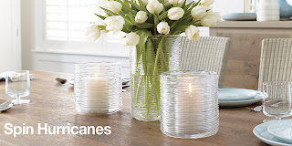
These spin style hurricanes are really nice and have some awesome texture.  I can envision some sand or a nice candle in them.  


Spin Hurricanes at $24.94 and $34.96

And last but not least, something decorative that I won't get upset for my puppy chewing on...


A Set of 4 Roe Ball Dog Toys for $19.80.

So hurry in to the new C&B in Plano....especially if you are in the mood for a sale.  Now through March 31st you will also find the 15% off slipcovered Upholstery Sale.  See you there! 


Tuesday, March 8, 2011

Room of the Month - The Kitchen

As if I wasn't busy enough, a former client asked me to assist her with a few updates at her home.  After the initial meeting, I left salivating.  They wanted to re-do a kitchen, gut a master bath, spruce things up in the outdoor kitchen, fix a few doors and update the office and bedroom. Do I have the time?  Absolutely not.  Should I do it?  Absolutely yes.  This is the best experience I can get, hands down, including any class I will take..ever..so that 4.0 average might be history.  Needless to say, I have decided it is worth it.
A favorite kitchen of mine by the New York design master,  Miles Redd.  Did you know blue kitchens tend to cause you to eat less.  Red kitchens more?

I luckily have a new talented friend.  Joe Shannon of Veritas Developers arrived an hour later after my initial scope discussion.  He and I met while I was looking for homes in the Park Cities.  He done a ton of remodels down there and actually still has keys to many of the places he worked on.  That means he faithful and good.  He's going to partner with me on this project and help manage all the subs and make the work happen.

And Joe can take pictures and bring them to reality.  As long as I help pick out what goes with what.  This dream kitchen?  Piece of cake!


I sent this picture to my client to get her ideas going.  I have tons of pics like this because I love white kitchens.  But for most, you either love white or hate it.  My client is not such a huge fan, so we will go with a more ivory stained cabinetry with warm brown throughout.  This is an important reminder that your client will not always like what you like....and as a designer getting that right at the get-go is essential.

Now that I've plunged on ahead with my project, here are some things you need to know about kitchen design:

1) Don't do it yourself - There are lots of things in the blog I tell you to go out and do, but this is not one of them.  You want this to be handled by a professional.  One that is going to measure and install everything correctly.  One that is insured, professional and gets things done on time.  I would ask for recommendation in your area.  It's important to find someone that knows the local building codes.  The guy that can tell you if you can stick a cooktop on an internal wall and still vent it appropriately.


2) Resale - You will get all your money back - or most of it anyway.  I'm serious.  The thing that sells houses are kitchens and bathrooms.  If you have a bad one bk, bad things will happen.  An update saves thousands.  Trust me, I'm considering selling my house again and I'm updating the kitchen, bathroom and hardware throughout the house.

A great kitchen from San Francisco designer, Palmer Weiss

3) Cost - It's far from cheap.  Sure you can whip up a new guest bedroom for hundreds, but a kitchen is going to run you thousands.  Save up and figure out how best to cut costs.  At our first meeting, I created my lovely excel spreadsheet with the client's dreams.  The four of us later sat down and started to deal with reality.  If we had to cut out something, what could it be.  Perhaps instead of installing all new cabinets, we will reface the old ones.  Meaning, we will take off the doors, paint or stain the bases and get new fresh doors on them.  In other words, don't try to do it if you don't have the money for it yet.  Be patient and save.  It's really important to do it right.

 A splash of lemon from Atlanta designer Turner Davis

4) Cabinets are going to be one of the biggest costs
Cabinets come in basic sizes, usually 12 deep for the top cabinets and 24 for the bottom cabinets.  You can stain or paint them.   I know a lot of people who are afraid to hire someone to do custom cabinets because its going to cost them too much.  But frankly, its pretty close in price.  (Unless of course you go with IKEA where you're trading time for money).  Trying to make your standard cabinets work perfectly in your space takes a math whiz....so go with the custom if you can.  And remember, not every cabinet has to match.  Some of can have open shelving, others glass doors.  Perhaps you have stained on most of the cabinets, but your island has a different color.  Don't be boring.

 I love the open shelving of this Christopher Peacock Kitchen....

5) Countertops...remnant's first!
There are a ton of materials out there from granite to marble to tile.  Get something that is heat resistant.  And if you got tons of kids, avoid the marble because it may stain (I have thrown that to the wind because I love carrara marble so much).  Be sure to ask your contractor about the size you need.  Often times if its not a huge piece, you can find these in a scrap yard and save a ton of money!  The guys who bought the big slab doesn't want the rest to hangout in his garage...so your beautiful guest bath just scored a great counter top!  I just did that today....my contractor bought me over the remnant from the last house and its going into my master bathroom Saturday.


Even though carraca marble is so expensive, I absolutely love it and hope to have it someday in my home.  Here's a slab of it.  Perhaps I can find a remnant somewhere....

6) Appliances and sticker shock
I know most think you need to run over to Home Depot or Lowe's and start buying.  But before you do, ask your contractor.  My guy actually knows of several places that buy left over stock of last year models and then heavily discounts them.  They often can put packages together and you can save big. Rob, one of the guys helping me with this project, works for Elite Appliance and is pulling together some great things.

Who wouldn't want a kitchen with filled with high end Thermador appliances?  And if they were last year's model the deal is even sweeter.

7)  The Working Triangle - The triangle between your sink, your refrigerator and cooktop should not exceed a permimter of 20 feet.  And nothing should be blocking the pathway of this triangle either.  You will be one happy camper when working in the space if you follow this advice.

Here is a sample of a working triangle

8)  Flooring - You are going to do a lot of standing in this room, so really consider putting some thought into the floors.  While I know you will avoid carpet, consider hardwood floors.  I know they were to be avoided due to water in the past, but we are so much further than that now.  Sealing will keep the water out and your floors looking stunning.

Hardwood or tile?  And I love how they mixed the cabinet wood here.  And no, your flooring doesn't need to match your cabinets....

9) Lighting - This is the one place where you will want lots of light.  Sure most of you will add the standard pot lighting on the ceiling and the under cabinet lights as well.  After the standard, take it up a notch and find the perfect light fixture to make the room sing.  Perhaps add a nice chandelier over the island or some pendants to add some spice.

Check out the nice pendants over this island

10) Take your time - This is a huge investment.  It's kinda of like the wedding ring.  Make sure you love it!  You are going to have it for a long time.  Pull pictures and hang them on a board and think about them a ton. Don't rush into anything and delay if you need to save up more money.   In the end, you'll be happy you did.

Perhaps this is your idea of perfect?  Remember it?  It's from the movie set,  It's Complicated.

Back to never ending to-do list,

C

Tuesday, March 1, 2011

Online Interior Design Magazines

Many of you know that one of my all time favorite things to do in my down time is read design magazines.  Paper or electronic.  I get so many ideas from them and enjoy saving those inspirational ideas for later use.  Loads of clippings laden my already overflowing file cabinets -- all sorted by room, of course.  However, an interesting trend has emerged in the last few years for me and that is the growth of the images that I am saving on my computer.  Some of my images come from other blogs but mostly they come from reading interior design magazines online.  Magazines have gone digital.  We are not in Kansas anymore, Toto.

Even though I am as much old school as any person in my circle of friends, the one trend that I have caught onto is e-zines.  And apparently, I am not in the minority.  According to emarketer.com, the number of people switching to online magazines is taking it's toll on the traditional magazine market.  In 2009, emarketer.com is quoted as saying "The shift in print advertising revenues to other media, particularly the Internet, will continue to thin the ranks of publications, and 2009 will be a year of survival for only the fittest publishers."  And so it was...at least according to my computer image growth.  That being said, I am thrilled to be sharing some publications that have emerged from the dust to take top priority in my e-zine reading.

HIGH GLOSS
Just released in January, High Gloss is written by two outstanding contributors in cyberspace.  Paloma is the blogger of La Dolce Vita and has combined talents with fellow blogger Kyle Knight of Knight Moves to create this little jewel.  You will not be disappointed.  Glamourous rooms along with insightful articles on design, travel and entertaining all grace the inside of this sparkling gem.  One look at the inaugural cover and the reader is captivated.  Bravo!
Check out the premier issue here

RUE
Another top pick is Rue in which Crystal Gentielelo of Plush Palate and Anne Sage of The City Sage join forces to create this dazzling plethora of genius ideas.  Published bi-monthly (who could possibly use all those ideas in one month only...) this e-zine features home decor as well as fashion.  Perfect combination for those of us with limited time to check out both separately.
Read more...click here....
LONNY
E-zine Lonny highlights great interiors in addition to innovative bloggers all the while keeping you abreast of the latest market trends.  Founded by designer Michele Adams of M. A. Belle and photographer Patrick Cline, the magazine has an enormous following.  With rumors flying around the biz that Traditional Home and Lonny are in collaborations, my heart is pounding with anticipation.  So is my pocket book....Look for it sometime May 2011.

Click here to peruse the latest issue...
IVY AND PIPER
If vintage modern is your passion, then Ivy and Piper is your place!  Australian design duo Melanie and Elizabeth met in design school and now tag team their passion in this eye-popping shelter publication.  Products from around the world find their way into this design trinket.  Including the wildly popular Etsy, with its its own online store.

NESTING NEWBIES
Jodi and Lea merged their ideas culminating in online magazine Nesting Newbies.  It bring together cooking, entertaining and home decor to serve as the perfect consolidation of the domestic life. You can do it all - offering easy, fun and affordable inspirations.


ADORE HOME
Founded and created by designer Loni Parker, Adore Home highlights interiors from around the globe. Providing tips and design advice from a multitude of experts, this Australian-based home and lifestyle rag is not be missed.


STANDARD
For those of you searching for eco-friendly design, this is the place for you. Standard was created by Kelly Plante who preaches "green is a standard, not a style".  Every issue is packed full of inventive ways to increase your use of sustainable products.  Home tours included - BONUS!

Read and subscribe here
COVET GARDEN
Covet Garden marries the seemingly unthinkable in landscape design.  Real spaces done by real people.  Not designers. Created by three forward-thinking gals, this nugget offers you a peak of actual homes in some of Toronto's premier gardens.


Click here to check out issue 7

Although I am certainly not promoting that we all ring up National Geographic to cancel our monthly subscription, I am asking you to consider what else "Kansas" has to offer in the way of e-zines.  Instead of trotting off to the newsstand or the local convenience store on your next reading whim, why not try the web?  Use these suggestions above to bolster your confidence.  The great part is --- they come directly to your inbox!

Happy Browsing-
C