Tuesday, March 8, 2011

Room of the Month - The Kitchen

As if I wasn't busy enough, a former client asked me to assist her with a few updates at her home.  After the initial meeting, I left salivating.  They wanted to re-do a kitchen, gut a master bath, spruce things up in the outdoor kitchen, fix a few doors and update the office and bedroom. Do I have the time?  Absolutely not.  Should I do it?  Absolutely yes.  This is the best experience I can get, hands down, including any class I will take..ever..so that 4.0 average might be history.  Needless to say, I have decided it is worth it.
A favorite kitchen of mine by the New York design master,  Miles Redd.  Did you know blue kitchens tend to cause you to eat less.  Red kitchens more?

I luckily have a new talented friend.  Joe Shannon of Veritas Developers arrived an hour later after my initial scope discussion.  He and I met while I was looking for homes in the Park Cities.  He done a ton of remodels down there and actually still has keys to many of the places he worked on.  That means he faithful and good.  He's going to partner with me on this project and help manage all the subs and make the work happen.

And Joe can take pictures and bring them to reality.  As long as I help pick out what goes with what.  This dream kitchen?  Piece of cake!


I sent this picture to my client to get her ideas going.  I have tons of pics like this because I love white kitchens.  But for most, you either love white or hate it.  My client is not such a huge fan, so we will go with a more ivory stained cabinetry with warm brown throughout.  This is an important reminder that your client will not always like what you like....and as a designer getting that right at the get-go is essential.

Now that I've plunged on ahead with my project, here are some things you need to know about kitchen design:

1) Don't do it yourself - There are lots of things in the blog I tell you to go out and do, but this is not one of them.  You want this to be handled by a professional.  One that is going to measure and install everything correctly.  One that is insured, professional and gets things done on time.  I would ask for recommendation in your area.  It's important to find someone that knows the local building codes.  The guy that can tell you if you can stick a cooktop on an internal wall and still vent it appropriately.


2) Resale - You will get all your money back - or most of it anyway.  I'm serious.  The thing that sells houses are kitchens and bathrooms.  If you have a bad one bk, bad things will happen.  An update saves thousands.  Trust me, I'm considering selling my house again and I'm updating the kitchen, bathroom and hardware throughout the house.

A great kitchen from San Francisco designer, Palmer Weiss

3) Cost - It's far from cheap.  Sure you can whip up a new guest bedroom for hundreds, but a kitchen is going to run you thousands.  Save up and figure out how best to cut costs.  At our first meeting, I created my lovely excel spreadsheet with the client's dreams.  The four of us later sat down and started to deal with reality.  If we had to cut out something, what could it be.  Perhaps instead of installing all new cabinets, we will reface the old ones.  Meaning, we will take off the doors, paint or stain the bases and get new fresh doors on them.  In other words, don't try to do it if you don't have the money for it yet.  Be patient and save.  It's really important to do it right.

 A splash of lemon from Atlanta designer Turner Davis

4) Cabinets are going to be one of the biggest costs
Cabinets come in basic sizes, usually 12 deep for the top cabinets and 24 for the bottom cabinets.  You can stain or paint them.   I know a lot of people who are afraid to hire someone to do custom cabinets because its going to cost them too much.  But frankly, its pretty close in price.  (Unless of course you go with IKEA where you're trading time for money).  Trying to make your standard cabinets work perfectly in your space takes a math whiz....so go with the custom if you can.  And remember, not every cabinet has to match.  Some of can have open shelving, others glass doors.  Perhaps you have stained on most of the cabinets, but your island has a different color.  Don't be boring.

 I love the open shelving of this Christopher Peacock Kitchen....

5) Countertops...remnant's first!
There are a ton of materials out there from granite to marble to tile.  Get something that is heat resistant.  And if you got tons of kids, avoid the marble because it may stain (I have thrown that to the wind because I love carrara marble so much).  Be sure to ask your contractor about the size you need.  Often times if its not a huge piece, you can find these in a scrap yard and save a ton of money!  The guys who bought the big slab doesn't want the rest to hangout in his garage...so your beautiful guest bath just scored a great counter top!  I just did that today....my contractor bought me over the remnant from the last house and its going into my master bathroom Saturday.


Even though carraca marble is so expensive, I absolutely love it and hope to have it someday in my home.  Here's a slab of it.  Perhaps I can find a remnant somewhere....

6) Appliances and sticker shock
I know most think you need to run over to Home Depot or Lowe's and start buying.  But before you do, ask your contractor.  My guy actually knows of several places that buy left over stock of last year models and then heavily discounts them.  They often can put packages together and you can save big. Rob, one of the guys helping me with this project, works for Elite Appliance and is pulling together some great things.

Who wouldn't want a kitchen with filled with high end Thermador appliances?  And if they were last year's model the deal is even sweeter.

7)  The Working Triangle - The triangle between your sink, your refrigerator and cooktop should not exceed a permimter of 20 feet.  And nothing should be blocking the pathway of this triangle either.  You will be one happy camper when working in the space if you follow this advice.

Here is a sample of a working triangle

8)  Flooring - You are going to do a lot of standing in this room, so really consider putting some thought into the floors.  While I know you will avoid carpet, consider hardwood floors.  I know they were to be avoided due to water in the past, but we are so much further than that now.  Sealing will keep the water out and your floors looking stunning.

Hardwood or tile?  And I love how they mixed the cabinet wood here.  And no, your flooring doesn't need to match your cabinets....

9) Lighting - This is the one place where you will want lots of light.  Sure most of you will add the standard pot lighting on the ceiling and the under cabinet lights as well.  After the standard, take it up a notch and find the perfect light fixture to make the room sing.  Perhaps add a nice chandelier over the island or some pendants to add some spice.

Check out the nice pendants over this island

10) Take your time - This is a huge investment.  It's kinda of like the wedding ring.  Make sure you love it!  You are going to have it for a long time.  Pull pictures and hang them on a board and think about them a ton. Don't rush into anything and delay if you need to save up more money.   In the end, you'll be happy you did.

Perhaps this is your idea of perfect?  Remember it?  It's from the movie set,  It's Complicated.

Back to never ending to-do list,

C

Tuesday, March 1, 2011

Online Interior Design Magazines

Many of you know that one of my all time favorite things to do in my down time is read design magazines.  Paper or electronic.  I get so many ideas from them and enjoy saving those inspirational ideas for later use.  Loads of clippings laden my already overflowing file cabinets -- all sorted by room, of course.  However, an interesting trend has emerged in the last few years for me and that is the growth of the images that I am saving on my computer.  Some of my images come from other blogs but mostly they come from reading interior design magazines online.  Magazines have gone digital.  We are not in Kansas anymore, Toto.

Even though I am as much old school as any person in my circle of friends, the one trend that I have caught onto is e-zines.  And apparently, I am not in the minority.  According to emarketer.com, the number of people switching to online magazines is taking it's toll on the traditional magazine market.  In 2009, emarketer.com is quoted as saying "The shift in print advertising revenues to other media, particularly the Internet, will continue to thin the ranks of publications, and 2009 will be a year of survival for only the fittest publishers."  And so it was...at least according to my computer image growth.  That being said, I am thrilled to be sharing some publications that have emerged from the dust to take top priority in my e-zine reading.

HIGH GLOSS
Just released in January, High Gloss is written by two outstanding contributors in cyberspace.  Paloma is the blogger of La Dolce Vita and has combined talents with fellow blogger Kyle Knight of Knight Moves to create this little jewel.  You will not be disappointed.  Glamourous rooms along with insightful articles on design, travel and entertaining all grace the inside of this sparkling gem.  One look at the inaugural cover and the reader is captivated.  Bravo!
Check out the premier issue here

RUE
Another top pick is Rue in which Crystal Gentielelo of Plush Palate and Anne Sage of The City Sage join forces to create this dazzling plethora of genius ideas.  Published bi-monthly (who could possibly use all those ideas in one month only...) this e-zine features home decor as well as fashion.  Perfect combination for those of us with limited time to check out both separately.
Read more...click here....
LONNY
E-zine Lonny highlights great interiors in addition to innovative bloggers all the while keeping you abreast of the latest market trends.  Founded by designer Michele Adams of M. A. Belle and photographer Patrick Cline, the magazine has an enormous following.  With rumors flying around the biz that Traditional Home and Lonny are in collaborations, my heart is pounding with anticipation.  So is my pocket book....Look for it sometime May 2011.

Click here to peruse the latest issue...
IVY AND PIPER
If vintage modern is your passion, then Ivy and Piper is your place!  Australian design duo Melanie and Elizabeth met in design school and now tag team their passion in this eye-popping shelter publication.  Products from around the world find their way into this design trinket.  Including the wildly popular Etsy, with its its own online store.

NESTING NEWBIES
Jodi and Lea merged their ideas culminating in online magazine Nesting Newbies.  It bring together cooking, entertaining and home decor to serve as the perfect consolidation of the domestic life. You can do it all - offering easy, fun and affordable inspirations.


ADORE HOME
Founded and created by designer Loni Parker, Adore Home highlights interiors from around the globe. Providing tips and design advice from a multitude of experts, this Australian-based home and lifestyle rag is not be missed.


STANDARD
For those of you searching for eco-friendly design, this is the place for you. Standard was created by Kelly Plante who preaches "green is a standard, not a style".  Every issue is packed full of inventive ways to increase your use of sustainable products.  Home tours included - BONUS!

Read and subscribe here
COVET GARDEN
Covet Garden marries the seemingly unthinkable in landscape design.  Real spaces done by real people.  Not designers. Created by three forward-thinking gals, this nugget offers you a peak of actual homes in some of Toronto's premier gardens.


Click here to check out issue 7

Although I am certainly not promoting that we all ring up National Geographic to cancel our monthly subscription, I am asking you to consider what else "Kansas" has to offer in the way of e-zines.  Instead of trotting off to the newsstand or the local convenience store on your next reading whim, why not try the web?  Use these suggestions above to bolster your confidence.  The great part is --- they come directly to your inbox!

Happy Browsing-
C

Tuesday, February 22, 2011

Class Update: Space Planning I

With all the talk of shutting down the Space Program at NASA, you can imagine my confusion when I was assigned the class "Space Planning I" in my recent curriculum at the Art Institute - Pittsburgh Online.  (For those readers that are confused as to why I am now "studying" in Pittsburgh and not Dallas anymore, please see previous blogs from late fall.)  Much to my relief, I quickly discovered that it was not space planning in the sense of launching a large metal plane into the air but rather arranging a room.  Whew!

Space Planning ended up being quite intriguing to me.  The assignment was fairly straight forward - take an imaginary client with an imaginary space and turn it into something completely different.  In this case, we were to turn an old gutted train depot (who has really ever seen one of those in this area of the country...) and repurpose the first floor into a dance/art studio and the second floor into living quarters.  While trudging through this seemingly gigantic problem, we were taught the finer points of space planning:

1) Prototype, Criteria Matrix and Adjacency Matrix - These documents sound boring but in reality they are like a huge puzzle.  These charts, diagrams and matrices allow the designer to put down on paper where items need to be and which parts of the design need to be near one another.  In other words, you don't want a bathroom in the smack dab middle of your kitchen but it might be good to have it near a changing room.  Below are a few of the documents from my project.  

A look at my criteria matrix...

2) Bubble Diagrams - Step 2 in the process involves taking the information from the above step and integrating it quickly into a rough floor plan.  The designer accomplishes this by taking the shell of the space and sketching bubbles and/or circles quickly.  Why so rough?  This step allows the designer to place all of the criteria for the space and be able to rearrange without wasting a whole bunch of time. 

3) Block Plans - After completing the "bubble diagram" with all the necessary components, step 3 is to ramp up the rough draft and create block diagrams of the space - similar to the one below.

4) Evaluate Codes and Requirements - Probably the most intensive step is this fourth one.  The designer must be able to locate and evaluate the local codes for the buildings - historical, special needs/handicap access, fire, etc.  Then plan accordingly with that information.

5) Schematic Design Floor Plan - This is where the fun begins....this floor plan is not the final cut but it is one step closer to completion.  Furniture, architectural features and the like are transferred onto this paper.  It's the plan most people think of when they think of a designer working up plans.

6) Furniture Plan - Finally, we select and draw in furniture with even more detail - including this time where the electrical outlets and also the lighting will be positioned.  

In a unique twist, my professor at the end of the semester, posed an thought provoking essay question to us on the exam.  Below is the question in it's entirety:

Some designers are able to envision a three-dimensional (3-D) space as they start space planning. The essence of the space as a whole develops from a pictorial view in their minds along with associated furniture and design elements. Other designers rely upon the space plan as a step-by-step process to graphically design the function while meeting the client's needs. Did you develop the character of the design from the plan, or did you envision and then plan? In your opinion what is the primary function of the space plan?

WOW!  I had never really thought of which type of designer I was becoming but relished the chance to do some self examination.  Through out this course, I consistently envisioned the 3-D space --- loft space, exposed brick, hardwood floors, mirrors and bars for dance, colorful stools pulled up to gorgeous tables and a luxurious master bath in the living quarters.  Although my original impressions of the space held true, in the end my ideas were refined resulting in better flow and design improvement.

In my opinion, the primary function of a space plan is to provide a logical way to bring multiple ideas into a FUNCTIONAL design solution.  Ideas become reality through a series of working documents that help the designer explore a ton of options.  As you work, each idea results in a clearer picture of the design solution without hindering the imaginative process. .  INTERVIEWS, RESEARCH and DIMENSIONS bring shape to the initial space.  While ANTROPOMETRICAL DATA, ERGONOMIC needs, CODES and UNIVERSAL and BARRIER-FREE design all result in changes and ideas that push the design further.   These changes result in the one initial vision transforming to multiple design possibilities.  Our textbook recommends producing THREE SCHEMATICS for each project and I couldn’t agree more.  This allows the project to "become more dynamic and versatile".  BUBBLE DIAGRAMS, BLOCK DIAGRAMS AND SCHEHMATIC PLANS all challenged my ideas, and a better plan resulted.  In the end, a thorough final plan is produced which is perfect for communicating ideas to a client. 

Despite the fact that I will always have pictures popping into my head when I initially look at a space, I will no longer assume they will automatically fit properly.  The space planning process will test those ideas and in the end I will have a stronger design.  This course has changed the way I approach the design process.  I no longer have to rely on design board pictures, words and chicken scratch napkins to communicate ideas. Now I can produce a professional graphic illustration of what is happening in the space.

So, even though I don't anticipate a phone call from NASA anytime soon asking for redesign, I now stand fully equipped to employ a step-by-step process that pushes my design to its fullest potential for my clients here on earth. And now I'm off to my next adventure...Perspective on Thursday.  Remember the days of a break between classes?

Still maintaing an "a" average-  

C

Tuesday, February 15, 2011

Art and my design job

I couldn't be happier with my job at Marco French Studio.  We are gearing up to design a house in lovely Palm Springs.  Marco, my boss and design master of 20 plus years, is headed out on their private jet to assess the situation while we get to drool over the pictures back at the studio.
In preparation for the new project, I forwarded Coco+kelley's timely blog to Marco.  It features artist James Nares's creative work. I thought one of his painting could be an option for the condo. 


He creates his pieces by suspending himself over a canvas in a selfmade harness.  Amazing.
  
Searching for artwork has become a favorite part of the job for me.  Marco often finds great pieces or artist and then forwards them on to his assistants to gather the details on.   I get the joy of visiting several art studios in search of the perfect piece.  I return with photographs, dimensions, pricing and then work on contacting our professional to schedule it being professional hung.


Where have I been headed to find these amazing pieces? Well, the design district of course.  Here is a quick sampling.


Holly Johnson has a great gallery and often contain very large pieces.  We have considered some of David Aylsworth pieces for a recent project.
David Aylsworth piece "I'm 41"


Another place I frequent is Conduit Gallery.  About a month ago, we had a small area needing some artwork.  As took some pictures in and two of the wonderful women there pulled out pieces they thought would work.  We had a great time holding them up while I photographed the ones that might work.  We eventually found a great piece.
Susan Barnett is one of their featured artist.  Here is a picture of Permeable and Impermeable Boundarids II and III, 2010.  Gouache on paper and is 30.5 x 44".


Craighead-Green Gallery is also another stomping grounds.  I love their space because you can really take in some of their painting.  


Their museum quality gallery.  
I love this sculture piece from J P Long, made of steel and glass.

Thie amazing work of Miami Artist Ramond Saa captured my attention too.  What detail. Created with acrylic, sumi ink and charcoal on wood.  He writes, "Being from Miami originally, I am most interested in the agressive and lush plants of the tropics and these are the plants that invade the canvas.  Their relationship to man as food or shelter or as a hindrance to him is also fascinating to me.  I reduce the 'foliage' to a monochromatic language to dramatize the drawing (or painting) with 'light' and its negative, creating a flat image; a pattern that is very separate from its original three dimensional complexity.


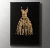
Restoration Hardware previously carried this "dress" by Murphy.


As for me, I'm still in love with artist Todd Murphy who creates those amazing dress paintings.   I wrote about him in a previous blog and he recently sent me a nice email stating how he enjoying reading it and that he soon would have an new website up, so stay tuned.  As some of you know, I finally ordered my treasure print from Restoration Hardware.  Several days later, I received a call from them that the shipment didn't meet the quality expectations.  And, I was out of luck.  They HAD NO MORE PAINTINGS!  I was devestated...and my huge niche remains without a pieces.  Perhaps I shall save up for an original.


I did recently discover another piece from my home by John Richard, called Golden Sky Giclee. It's fairly large (65 1/2" H x 49"w) and will take some time to install so I don't have any pictures of it quite yet.   I found it on sale, of course, at Horchow Finale.  Not only was it on sale, but I had my 40% coupon off one item, so I got it for a steal.  


As you can see, art is a huge part of the design world and I can't get enough of it.  I've been waiting patiently for my upcoming Art History Classes, but I 'm still treading through those entry-level drawing classes.  Which explains why this blog is pretty choppy.  Last night I was up past 1 AM drawing floor plans for my Space Planning final....


Until the next piece,


C


Tuesday, February 8, 2011

Room of the Month - The Master Bedroom

Love is definitely in the air everywhere we look around.  Jewelry stores, pajama grams, teddy bears and yes even toy stores are managing to cash in on our insecurities this time of year.  I'm talking about Valentines Day.  It starts young - preschool to be exact - with the exchange of paper hearts and builds from there.  The pressure to purchase just the perfect something for your perfect someone.  Luckily for the Moss family, hubbie and I are on the same page when it comes to this "holiday."


Every year my husband and I gaze longingly into one another's eyes and whisper,"You really don't have to get me anything." And we both breathe a sigh of relief. You won't find the Moss's booking the Sweetheart Package at the downtown hotel or overpaying for a good meal (although we have been known to cut a rug with a dj till we are sweaty a time or two).  Not us. We would rather get away from it all when there is no one else around.  Or, in my case, plop down the dinero for a yummy set of new sheets for my own bed. Cozy up and enjoy a bottle of Silver Oak from the nightstand. That being our plan this year, I thought it would be a month to discuss some finer points of creating your own oasis in the master bedroom!   

WHEN IN DOUBT, TAKE THE UPGRADE!  I could say things in this section like, "It's your room." or "You deserve it."  But practically speaking, this is the room where you spend the majority of your time.  It's really that simple.  Why not put your money where you will get the biggest bang out of it?  Unlike your little rug rats, you are not going to grow out of your room anytime soon so do it up right! After all, you do use it every day...  Resolve from this purchase forward that you will upgrade (within budget) to the softer sheets, the fluffier pillows, the tempting candle and the breath-taking chandelier. 
Who needs a hotel when you have a room like this at home?

RESTFUL – With the busy-ness of all of our lives, this is NOT the room to embrace your inner wild child. (decorating that is...) This is the place where you want to keep it calm and restful.  Since we mostly use our bedrooms for sleeping and the occasional television watching, this room should make you feel peaceful.  You should want to enter it willingly each night, if not expectantly.  With the walls and bigger pieces in the room, allow the colors to be muted,calm and neutral.  Add spice with shades, pillows and other accessories. 
Atlanta designer, Suzanne Kasler makes the peacful look easy by using netural colors of white, blues and browns. 

AVOID MULTI-PURPOSE – Although I would love to think that each and everyone reading this blog has the means for separate space, sometimes this is simply not the case.  Several of my colleagues have rooms that serve dual purpose as a bedroom and an office.  Take it from them....rarely does it work effectively.  Reason?  It's just too darn easy to get up in the middle of the night to work or just too easy to keep working when you should be asleep.  If sharing your bedroom and your office is not an option, then make sure there is a clear distinction between the two.  A bookshelf, a screen or curtains do wonders for creating privacy as well as a boundarybetween the spaces.  The last thing you want to see when you doze off at nighty-night time is the computer screen yelling at you with your unfinished project front and center.
Use neat screens like this one to separate the space
...or a ceiling to floor curtain helps keep the living area and bedroom area unified but separate.

CANDLES – What better way to snuggle in at night than to nestle into fresh sheets with the windows open?  What a luxury!  But when the weather won't allow you that little boost, then make it yourself - with a candle.  Every night, I light a candle in my bedroom about 30 minutes before I tuck in at the end of the day.  It smells delicious!  For a nice selection of premium candles, check out Paper Affair or Horchow Finale.

STORAGE – Don’t skimp here.  Maybe we don’t all go to bed with someone, but definitely with someTHING.  It could be: the book, the magazine, the ipad, the glass of wine, the remote, the jewelry we wore all day, the laptop, the kids report cards....you get my drift.  All of these essentials need a place to belong in your bedroom.  Think through what you normally bring in with you at night and make the appropriate choice for your storage needs.  Adding storage to your bedside will increase the peace and restfulness of the room with tidiness.  Personally, I selected a nightstand from IKEA with drawers and went to town making it my own.  Being that hubbie isn't always tidy (his side of the bed is named the hamster cage) the drawers in these stands are the key.  They hold a ton of junk but it's out of sight so it's all good. 
Nightstands are key to storing stuff and keeping the place tidy and peaceful.  When in doubt, make each side symmetrical.

LIGHTING – Glaring overhead light is a no-no in this room.  When moving to Texas, the builder assured us that we would want ceiling fans in every room because it gets blistering hot here.  He was right about the heat but wrong about me wanting the fans.  I hate them.  Despise them.  They dry my mouth out at night and spread all kinds of dust everywhere in the room.  Gross.  Just turn down the air.  Over time, I have replaced each of the room fans with chandeliers or other light features.  Also of importance...a dimmer for those bedside lamps and buy PINK bulbs.  Yes, pink bulbs will add that certain ambiance that you just don't get with those other bulbs.  Beautiful and romantic.
Doesn't Barclay Butera's chandelier choice do wonders for this room, especially over a ceiling fan? 

REALLY, MAKE YOUR BED – Morning person, I am not.  My friends and family will verify that statement hands down.  People used to share with me that making their bed in the morning did wonders for their daily attitude.  Really?  Sounds like bullcrap to me.  But eventually I dove head first into the habit with my other option being drugs.  Amazingly, it worked!  The extra 2 minutes it takes to make the bed is like a little surprise waiting for me when I return from my long day.  I jump right in for a quick rest before I make dinner.  Try it.  Cheap and worth it.  


Keep it simple.  Fold the comforter at the end of the bed, pull up the sheets and fluff the pillows.  Viola!

     ONE CHANGE – TEXTURE.  I'm often asked about the one change that makes the most impact in a bedroom without breaking the bank.  That change would be texture.  Usually when I evaluate a room, it lacks texture -- something to play with the eye.  Texture is something that gives weight or feel to a space.  Technically defined texture is:“A measure of the variation of the intensity of a surface, quantifying properties such as smoothness, coarseness and regularity”.  Layman's terms? Something you can't keep your hands off of and want to touch.  How about adding a pillow with beef to it or a shiny mirror and a nubby throw across the end of the bed?  These simple pieces of texture will do wonders for your room.
Sure the wallpaper is great and the headboard dramatic, but what really makes this bed is the textured pillows!
     
SILK DRAPES  - So expensive and SO beautiful.  Floor to ceiling drapery is a bedroom necessity and makes it divine.  Can't afford the moolah?  Don't abandon the dream so quickly.  Check out www.drapestyle.com or www.halfpricedrapes.com.  In addition, they sometimes even have great sale items.  
 These beauties are in my guest bedroom now.  Come one, come all.  On sales for $250 (50x120) for both panels.  All silk, lined and weighted with French clips.  A deal!
Love the silk drapery in this room!

Pictures – Bring in the kids! (in pictures that is...)  Silver frames add sparkle - especially in a grouping.  Add some of you and your loved one too to make the space complete.

This year, why not begin a new Valentines Day tradition?  Ditch the dinner and flowers and add some upgrades to your bedroom instead!  You'll welcome the joy that these additions will bring to your life and not miss the heartburn at all.  So, enjoy your Valentine’s Day.

Go Packers-
C


Wednesday, February 2, 2011

The Art of the Blog

"Happy Birthday to me....happy birthday to me....happy birthday dear Why Not? blog....happy birthday to me!"  Ok.  I'm a bit early, but March 10, 2010, marks the beginning of my crazy ride into blogging - the birth of this bittersweet marriage of adventure and heartache in the design world.  Many have asked me the reasoning behind it and it's really quite simple:  I wanted to share my design ideas about beautiful rooms and talented designers who produce spectacular rooms.  More importantly, I had a deep desire to document my foray into design school as a 40 something mom (in other words, if I could do it...anyone can). 
LA Designer Mary McDonald, one of my favs, graces the cover of Domino Magazine.

Now just because I like to blog doesn't necessarily make me an expert.  It became quickly apparent that there is an art to blogging that I (to be brutally honest) knew squat about.  Sure, writing is important but who wants to hear an expert drone on about topics that only the expert likes? My faithful devotees yearn for more than just words on a page- they want photos.  The formula that works best for me is :  photos + interesting topics + honesty = success. 

There are some eye-popping examples of design blogs in cyberspace.  La Dolce Vita, Material Girls and Coco-Kelley are in the favorites bar at the top of my homepage.  Follow that up with the e-zines High Gloss, Rue and Lonny.  The funny thing is that many of these creators aren't even designers by trade but just some average joes that worship design.  The thrill of my inbox bulging with these jewels makes my life complete.  With their arrivals, come fresh ideas and fresh places to buy goodies along with snapshots that I'm able to save on my mac to pass onto my subscribers. 
High Gloss was just released yesterday!  And began as the result of a team of outstanding bloggers.

Don't get me wrong.  There are some stinky blogs out there clouding the view.  Those I immediately dismissed with the push of a button - never to return to my screen.  Even with my love of design and my head stuffed with nuggets of greatness, I understand my limits.  Just like the creators of Rue, I knew that I needed a team mate to round out my rough edges.
Another great online design magazine...Rue


Enter my buddy Jen.  Part editor, part sounding board and a whole lotta of fun...Jennifer boosts my blogging to a level that easily conveys my personality to the world.  Her editing skills give me that zing in an otherwise ho-hum endeavor.  Thanks. friend. 

Enough about the past.  As with any upcoming landmark birthday, it's time to ponder the future.  Where do I want to go? Coming out of the gate first is my intense desire to get this craziness out of my head and onto the page.  I thrive on chronicling this adventure of design.  It keeps my eye on the prize.  A constant reminder of the mountain I am climbing being an baby designer along with the successes and challenges.  I want to lay bare my progression to my readers in a crisp way - whether it be a new furniture discovery, a fabu paint color or a yawner class assignment.  

Recently I have had the huge honor of becoming blog manager for Dwell With Diginity here in Dallas.  I've mentioned DWD in a prior blog and cannot say enough wonderful things about this non-profit.  The stated goal of DWD is to bring good design to those less fortunate by inspiring them through their living environment to be the best they can be in life.  In other words, bringing beauty and serenity to their homes and having that flow over into all aspects of their life.  The beauty of this project for me is that I am able to manage this from my home and still know that I am contributing to  a worthy cause.  My job description?  Lining up the bloggers and topics for the site while managing the overall flow.  Exciting!
DWD Founders Kim Turner and Lisa Robison after their appearance on Good Morning Texas.  

In thinking forward for the Why Not? blog, I realize that my blog (however spectacular in this infancy stage) can be cranked up a bit.  I would absolutely love, love, love to attend the upcoming blog conference in LA February 28th - March 1st.  This gathering will feature my personal favs:  Palmoa Contreras of La Dolce Vita, Casandra LaValle from Coco+Kelley and Grace Bonney author of Design*Sponge.
Cassandra LaValle from Coco+Kelley will be sharing tips from her successful blog.

Of course there will be designers of all sorts there for the soiree also:  Jan Showers, Barclay Butera and Tobi Fairley.  Unless a sugar daddy pops up in the next few weeks (which with my schedule, who has the time), the chances are zilch that I'll be learning from these gurus in person.  If only Harrison Ford was willing and available...Pinch self.  Wake up.
Atlanta designer and blogger Tobi Fairley will be speaking on How to Build Your Interior Design Business

Availabillity is something that I'm lacking right now.  Design school, dream design job, volunteering for DWD and Paws the new puppy (more about the name in later posts) are all vying for my time.  As of publication, Paws is winning the competition hands down with her cutie patootie puppy snuggles.  So, LA will have to pine for me this year. 
My new puppy Paws...

Time to pack up the pointy pre-birthday hats and streamers until next year.  Snap the photo for the scrapbook and move on with life.  Join me in staking claim to another milestone in my design progression.

More cake, anyone?

C